Connecting data, plans, and people.
“Connected-business-planning platform-cloud-technology” isn’t a well-known industry. To most, it sounds like the set-up for a joke on HBO’s Silicon Valley. But among those who depend on it, they’re looking for a powerful application catered to their business needs. An application with enough utility to leave Excel in the dark ages. Enter Anaplan.
Once the Anaplan platform went live, the connected planning landscape began to rapidly shift. With one of the fastest-growing brands in the industry, the Anaplan marketing team needed fast and distinctive designs to match.
Branding
Over the course of four months we created, perfected, and implemented an entirely new brand. We developed a design system that would not only distinguish Anaplan from competitors, but also unify it – ensuring that the branding felt cohesive across all media. The color palette, typeface, iconography and photography all helped convey the versatile and flexible nature of the product.
During the research and brainstorming phases, I controlled all day-to-day tasks. Because the other two designers focused solely on the rebrand, my workload multiplied to compensate for the sudden lack of designers.
Once the look, feel, and logo was established, I began to develop the photographic and illustrative styles. The brand concept was based around “perspectives”; the idea that Anaplan’s software can help users oversee and manage every angle of their company. I wanted to illustrative and photographic styles to reflect this idea.
The Illustration Style
For the illustrative style, we chose to echo the “perspectives” concept by emphasizing 3D planes. The product was a mix of realism, geometric forms, and a high-contrast palette.
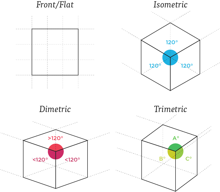
To keep the illustration style consistent, I designated four types of projection grids: flat, isometric, dimetric, and trimetric.
The Photography Style
The photo style utilizes a duotone filter, emulating the logo in a contemporary and eye-catching way. We used the Anaplan Navy (the primary brand color) for shadows and individual accent colors for lights.
“At the heart of the identity is a single, distinctive ‘A’ that juxtaposes positive and negative space to reveal the symbol. It is the perspective that makes the A, not the literal drawing of it. Furthermore, the symbol can be displayed from different angles. A slight rotation here, a pivot there—a changing of perspective—and the object takes on a new look, a new meaning, a new utility, even though the object itself has remained entirely unchanged.”
Alvin Perry | Creative Director
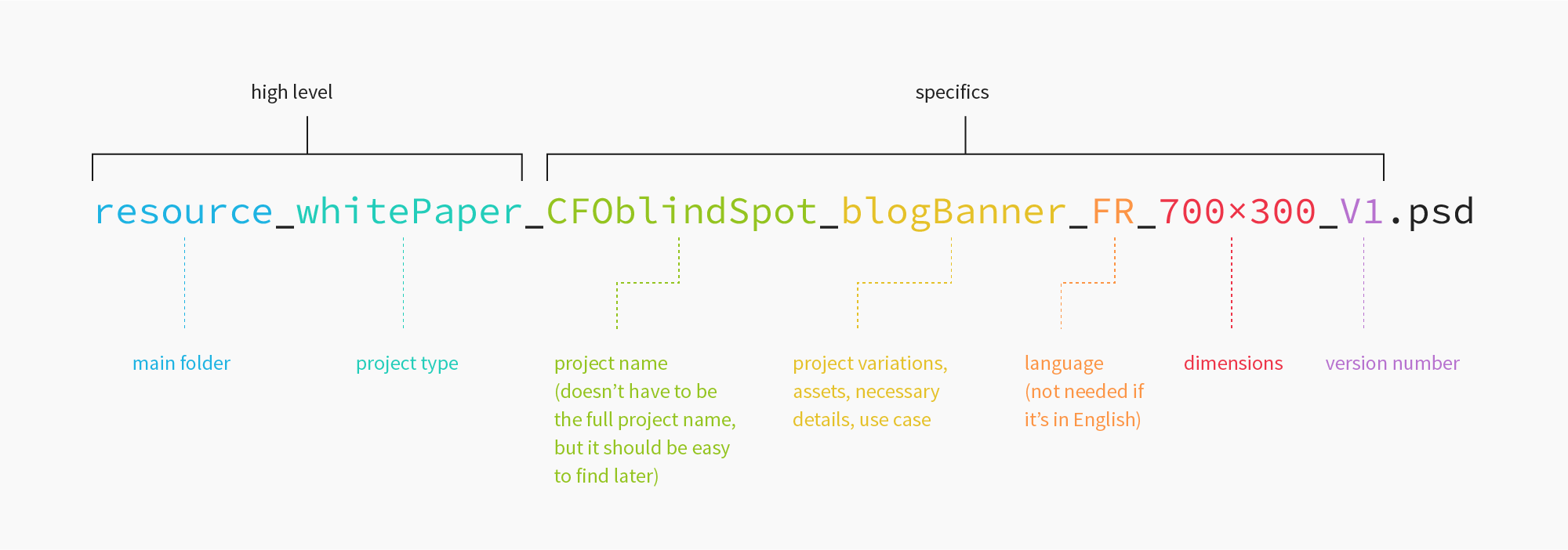
After the brand concept was developed, I decided to tighten up the file naming conventions and folder hierarchy to streamline our workflow.
Production design
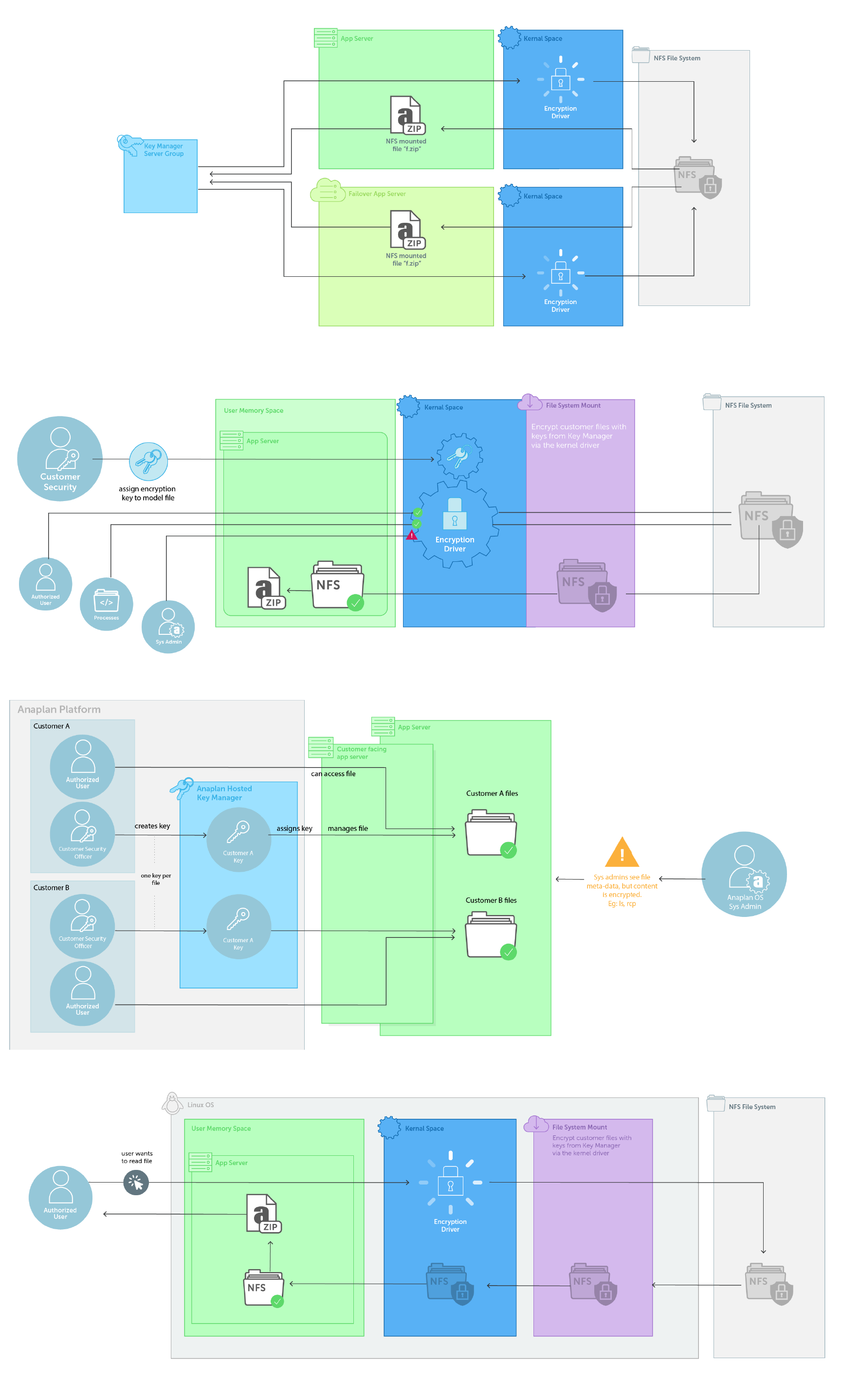
Anaplan had an absolutely fantastic design squad, but we were slightly understaffed. This meant that even though most of my design duties were under the Marketing umbrella, I frequently collaborated with the Engineering, HR, Executives, and Sales teams.
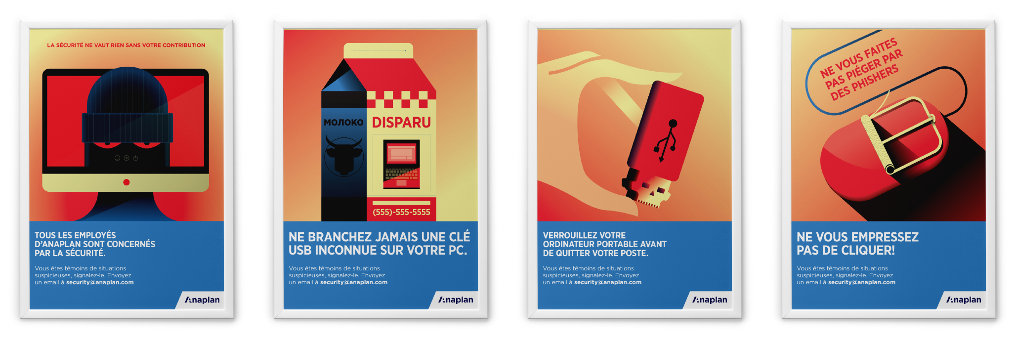
This interdepartmental collaboration yielded two things: a wide variety of projects (conference banners, back-end flowcharts, animation, infographics, data-sheets, white papers, case studies, in-office signage, pitch decks, partnered company creative…) and a better understanding of the company as a whole.

